brands built from the logo up
When Tennessee Chiropractic was looking to rebrand themselves they turned to C CADY DESIGN for a unique, new design. We began by revising the name to be more appealing to a skeptical consumer base of chiropractic services.
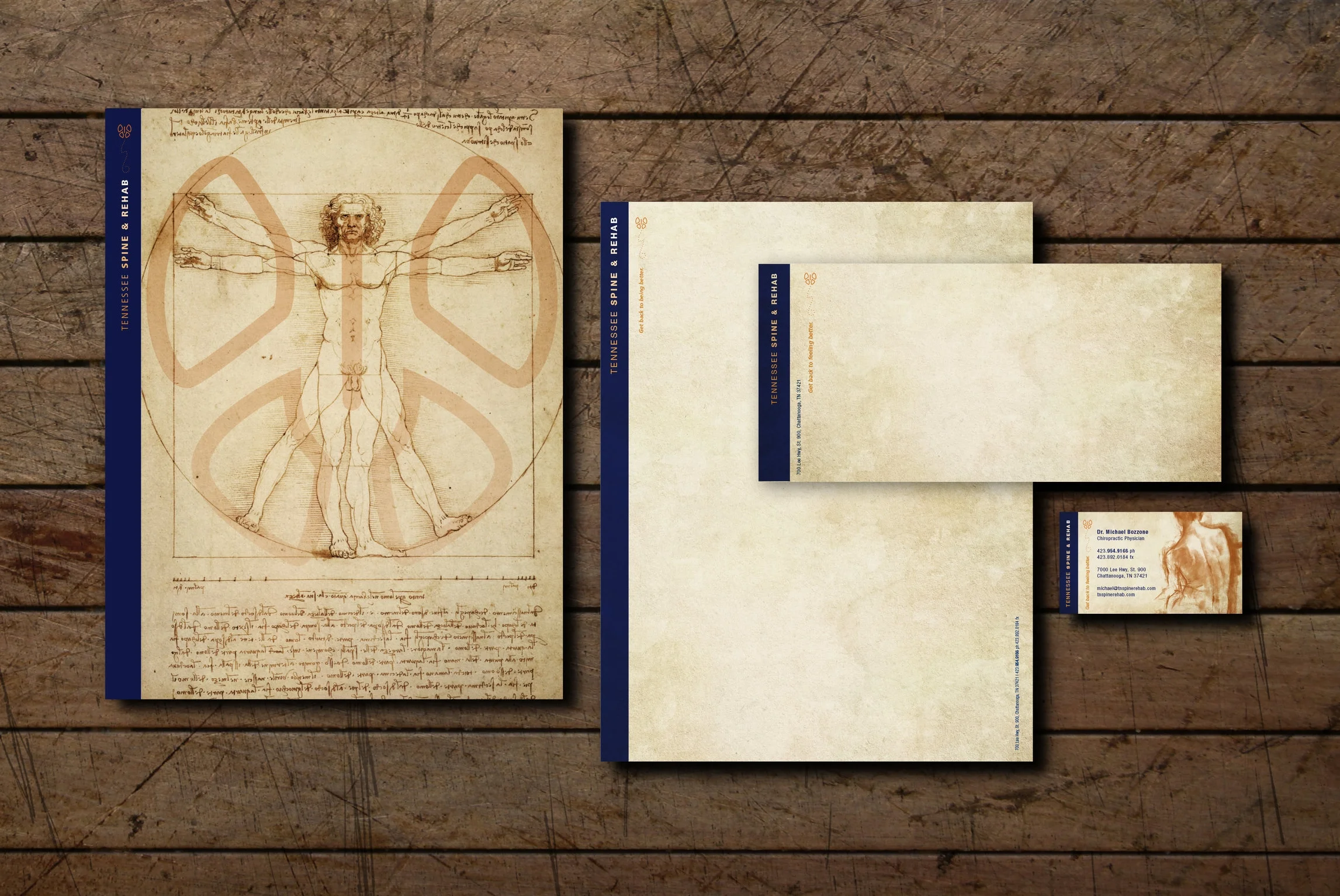
The butterfly logo was inspired by Leonardo Davinci’s, Vitruvian Man drawing depicting the range of motion of our arms and legs fill. Like a snow angle the form suggest a butterfly which became a great icon for freedom, health and …” Getting back to feeling better”, the tagline we developed for the brand.
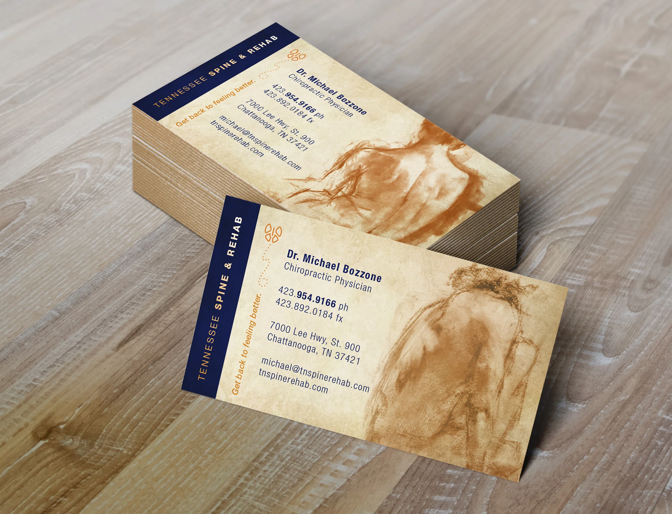
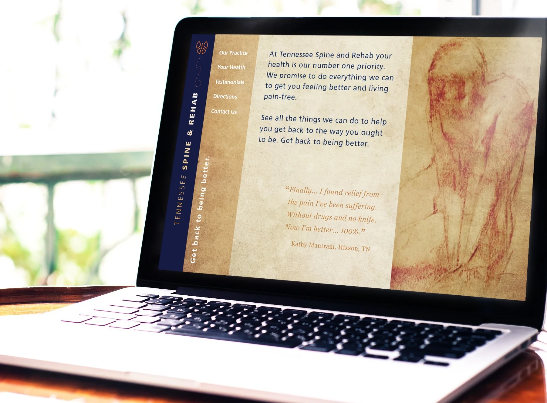
The human figure drawing became a natural visual to help speak to the our body, muscle, health and even emotion.
SCOPE:
• Naming
• Logo Design
• Business Card & Stationery Design
• Folder Design
• Services Brochures
• Website Design